There are several ways to create flesh tones by mixing watercolors. Unfortunately, when I first started drawing portraits, I was not aware of these possibilities. I thought I knew exactly how to achieve a flesh tone using just Jaune Brilliant No. 1 and No. 2, but I was always unhappy with the results. The Burnt Umber I used to create dark and deep shades and mixed with white paint made the final look dull and lifeless. I reached a dead end and didn't know why.
It took a long time to realize my mistake and understand that white will never be the decisive color when mixing flesh tones. In fact, over time, I've learned several ways to bring portraits to life - and none of them involve the Jaune Brilliant, Burnt Umber, or white paint that I've come to value so much over the years.
If you want to achieve a Caucasian skin tone:
- Cadmium Red
- Yellow Ocher
- Cerulean Blue
The flesh tones are much more complex than the pink tones I thought I could get out of the Jaune Brilliant paint. In fact, the creation of skin tones is based on a combination of red and yellow pigments. Mixing Cadmium Red and Permanent Rose together creates a gorgeous flesh tone that can be used for highlights, while shadows deepen when added with Yellow Ocher. If you find the resulting shades are too warm for your taste, you can always add a drop of Cerulean Blue to make it a little cooler.
As an alternative...
- Cadmium Red Light
- Cadmium Yellow Medium
- Dioxazine Mauve
Mixing Cadmium Red Light and Cadmium Yellow Medium also helps create an elegant base shade. To create shades, add Dioxazine Mauve.
If you need to depict dark skin tones:
The last palette used mostly colors in the orange/violet spectrum and it produced some really great results, I think the first palette which mixed Cadmium Red and Permanent Rose is much more versatile . Moreover, it is precisely this that can be easily turned into dark shades.
- Cadmium Red
- Permanent Rose
- Burnt Sienna
- Raw Umber
Instead of Yellow Ocher or Blue Cerulean, use Burnt Sienna to create darker skin tones. If a dark pigment is desired, add Raw Umber until you are happy with the final result.
Adviсe:
- There is no place for white when it comes to drawing a portrait! If you think the color is too dark, you may be tempted to add a little white to lighten the tone. It is the addition of white that results in uneven color and makes the portrait look flat. It is much better to add a little water until the desired shade is on the paper. If you have already applied paint to your brush and suddenly feel that the tone is too dark, take water, a brush and a cloth towel to gently remove the paint from the sheet.
- Use a piece of testing paper to avoid unwanted color. Cadmium Pink mixed with Permanent Pink looks quite dark on the palette, but on paper it looks like a completely natural tone. It is not difficult to forget that watercolor paints become lighter as they dry. It is for this reason that it is very useful to have a sheet of test paper on hand. Make sure the test paper is exactly the same quality as the one you are painting on, as the quality of the paper plays a major role in the final color.
- Work on your painting in layers. Skin is made up of many colors, rather than one color for the shadows, another for creating the undertones, and another for the highlights. The power of watercolor lies in its ability to create almost transparent layers, giving the opportunity to create layers of deeper shade. Gradually layering the colors will also save you from ruining the entire design, which you spent about two hours on to apply a thick layer to the paper, which you may later regret.
- Don't forget to add white when drawing the eyes. When you start painting the first translucent base coat of the portrait, don't be afraid to apply white in the eye area. There is no such thing as a pure white eye - in fact, it only appears that way in photographs. The contrast between the eyes and skin can be increased when undertones and details are added later.
- Be aware of your surroundings. If you draw an image of someone near a red wall, then there is a chance that the skin will be redder than that wall. Why? The light illuminating the depicted object is likely reflected from the red wall, absorbing the color. Try it yourself; Find a piece of colored paper or a piece of plastic and stand in front of a mirror in direct sunlight. The closer a colored object is, the more of its pigment is reflected on your skin.
In order for a pictorial portrait of a person to turn out alive and natural, the artist must be able to compose well the flesh color. Each painter has his own secrets, but still there are general rules and patterns, knowing which you can easily compose any shades. Let's learn this art together!
Let's say you decide to paint. What paints do you need to have on hand to make a person out of them? Firstly, you need to stock up on whitewash, but you will need to delicately mix other paints in small portions. Healthy is always a gentle warm shade, because our entire skin is penetrated by the smallest network of blood vessels. To experiment, take a sheet of white paper, apply it to the face of the palest young lady, and you will see how strikingly different even the lightest flesh color is from the lifeless white color of a paper sheet.
So, white paints must be accompanied by paints such as ocher, red, and, perhaps, sienna or umber may also be useful. But the latest paints can only be used when applying shadows and very carefully. Squeeze a little white from a tube onto the palette, dilute it with a solvent and add a little ocher, red and yellow to it. In this case, more ocher should be used, and, naturally, less other colors.
Different shades of flesh color
In painting there are no ready-made recipes for different shades; everything depends on the artist’s intuition and, of course, on the complexion of his model. After all, if you draw a person with dark skin, his flesh color will be significantly different from the skin color of an untanned, pale person.
Then you need to know that women's skin comes in lighter and more delicate tones than men's. And the flesh color of the torso, arms and legs is also darker than the skin of the face. Different areas of the body may differ in color. In painting there is such a thing as reflexes. This is the reflection on the surface of objects of color spots that are nearby. For example, if your model has a red cap on her head, then a warm reddish glow will certainly fall on the face you want to draw. All this must be taken into account when working on a portrait.
How to achieve flesh color when drawing
With watercolor everything is much simpler, but some may find this material more difficult than oil. The fact is that when working with watercolors, the role of white is played by the white background of the paper itself. After all, watercolor is transparent, and it should be applied very lightly so that the lower strokes can be seen through the upper ones.
Now let's start composing the flesh color. Take a plastic palette and drop some water on it. Then take a soft squirrel brush, wet it well and lightly, with the very tip, brush it over the red watercolor paint from the box. Then stir this brush in the palette with water, and you will get a faint transparent pink color. Add a little yellow there, just don't overdo it, you only need a little bit. And you can start painting a portrait.
Examples of portraits with perfect flesh color. Photos of these paintings
In the history of Russian painting there were many artists who painted portraits beautifully. Rokotov, Levitsky, Bryullov... Take a reproduction of the portraits of any of these painters and look carefully. With what skill they managed to convey the most complex bodily shades!

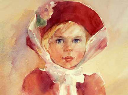
Here, for example, is a portrait of Maria Lopukhina by V. L. Borovikovsky. What a wonderful complexion this woman has and how skillfully the freshness and youth of her skin is conveyed! Try to unravel the artist's secret. What paints did he use to achieve this result, do you think? The best way to try to figure out the secret of the great master of painting is to sit at an easel with a palette and brush in your hands.
Selecting the right shade in watercolor often seems quite difficult, but it is not, and just like in other types of painting (for example, oil), it is created by mixing different colors. This also applies to how to get skin color from watercolor. In this article we will try to sort this out.
To begin with, let's mention an important feature of watercolor. Unlike oil, where white is used to lighten the color, in watercolor, paper is used for this purpose, which is visible through the paint layer, as well as water, which dilutes the paint. Therefore, in order to make flesh color with watercolors, it is not at all necessary to use white paint.
How to get skin color with watercolors
First, let's prepare watercolors, water and brushes. As a palette, you can use a paint lid, cardboard, or watercolor paper itself - any surface that will not immediately absorb paint.
Next, we apply red color to our palette, and then ocher (or, if it is not there, mix yellow and brown). They can be mixed in equal quantities or with a predominance of ocher, depending on the skin tone.
To make the color less saturated, dilute it a little with water (but do not make it completely pale, given that watercolor often loses its brightness when drying). We apply the resulting shade to areas of the skin - this way we will create a “tint” that will shine through the upper layers and set the overall tone.
It’s okay if at this stage you can’t exactly hit the desired shade; it’s much more important now to set the desired tone. The tone can be warm or cold; in a living person it is usually warm, even if the skin is very pale. Therefore, in order to accurately convey skin color in watercolor, it is not advisable to add cold colors at the first stage. To show the lightness of the skin, just dilute the paint with water.
Further work process (layers)
When applying further layers, you can use other colors: brown, blue, green, earthen and their various variations. Cool colors are often mixed with warm colors (brown, ocher, yellow) to create shadows, sometimes they can even be used alone to contrast with warm fragments. In order to paint skin more accurately, you should carefully look at the person’s face, photograph or drawing from which you are writing.
Skin tone chart
To make it easier for you to choose the right shade, we have compiled an approximate table of color relationships. Of course, there are many more shades, but using the example table you can get a general idea of the patterns of color mixing. In addition to the flesh color characteristic of Europeans, the table also includes others that are suitable for writing the skin of representatives of Asian, African and other races.
 |
20% brown/ochre (can be orange) diluted with 80% water |
 |
20% red 80% water |
 |
20% - brown, blue and yellow colors mixed in equal proportions 80% - water |
 |
80% - brown and yellow mixed in proportions 1 to 1 20% - blue |
 |
100% - brown and yellow (1:1) |
 |
60% - brown and yellow 40% - blue |
 |
60% red 40% brown |
 |
50% brown 30% blue 20% yellow |
 |
80% - brown and red (1:1) 20% - blue |
 |
40% brown, you can add a little ocher or yellow 60% blue |
 |
20-30% brown 70-80% blue |
 |
100% - red and blue (1:1), you can add a little brown or ocher |
 |
30% red 70% blue |
| 100% - blue and brown (1:1) |
As we can see, to obtain a warmer shade, colors such as red, brown, yellow, ocher should predominate; for a cool shade, blue is most often used.
We hope this article has given you a good enough idea of how to create skin color in watercolor. Good luck with your creativity!
Method 2:Skin tones 1Skin tones 2
All experienced human artists are increasingly showing an avid interest in creating realistic skin tones. Over time, you will create your own matching color combinations, but a little help in understanding the proper ways to mix colors will help you get started.
Steps
Method 1 of 2: Skin Tones 1
- If you add red, the color will look more pink.
- If you add yellow, the color looks warmer.
- Red and green make brown
- Red and yellow make orange
- Red and green are complementary colors.
Warnings
- Start with the smallest amount of green you can, you can always add more. You don't want your skin tone to turn green!
- Don't be afraid to add green. Light green strokes will help create more vibrant shadows, and red areas will become warmer. The best way to brighten colors is to gradually add additional colors, even if at first glance this seems counterintuitive. A touch of green will brighten the red. A dash of magenta/violet will do the same to yellow.